Let This Chart Help You Find the Direction of the Market
As published on MarketWatch Trading Deck October 27, 2016
As we close the gap to within two weeks of the U.S. presidential election, the stock market is giving us a decisive picture, showing just how indecisive investors are during this uncertain time. The bad news is there are still two weeks remaining until Nov. 8. The good news? In two weeks, the market will be telling us whether it wants to move north or south. The million-dollar question: Which will it be?
I come from the school of thought that says, “The charts predict the news, not the other way around.” Granted, there is always the chance for a false signal, but more often than not, the market will tell you where it wants to go. As long as you swim with the direction of the stream, you’ll be in good shape. Swimming against the current, on the other hand, can lead to portfolio exhaustion, painful drawdowns, and in extreme cases, enormous realized losses of money you can only hope to regain. Naturally, in order to swim with the current, you have to know which way the current is flowing.
Determining the current trend of the markets is key to the success of your investment portfolio. Every investor has a different time frame, so I’m going to break things down into the three time frames we follow.
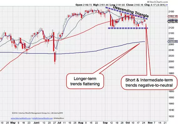
As you can see in the chart below, the short-term, one-week moving average (black) is below the one-month moving average (gray) while the latter is also trading below the three-month (one quarter) moving average (red). This tells me that the short-term trend is negative/down.
Market trend chart — Columbus, OH — Libertas Wealth Management Group, Inc.

Finally, and again, as mentioned above, the one-quarter moving average (red) is trading above the one-year (blue), which tells us that the long-term trend still remains positive. However, the elephant in the room is the fact that the one-year moving average is starting to flatten out again, indicating that prices could be heading south from here. Does this mean we sell everything we own? No. But it does validate the intermediate-trend, which again states that we’re in “wait and see” mode.
Another important pattern I wanted to point out is that of the descending triangle that has formed over these past six weeks. The psychology behind this chart pattern is that buyers stepped in to buy the market at roughly the 2120 on the S&P 500 SPX, -0.23% level, and eventually, those buyers dried up as price rose. As a result of buyers leaving the stage (likely because they felt price was too high to continue buying), the market gradually faded until it closed in on 2120 again, a point at which buyers jumped back in — but fewer this time — as illustrated by the lower high, which has created the descending top (resistance) of the triangle pattern.
Typically, all the buyers who supported the market along the floor of support dry up in patterns such as these, and eventually price breaks down and resolves in a bearish manner. This downside pressure again corresponds with the short-term downtrend, intermediate-term weakness, and the flattening of the longer-term one-year moving average.
That was a lot to digest, but the bottom line here is simple: Only aggressive investors should be dipping their toes into the stock market at the moment, and by “toes,” I mean, don’t go “all in.” Put one-quarter of your money to work and then wait and see how the market reacts to the coming weeks of volatility.
If the market breaks out above the descending trendline (above) and closes for a few days above 2150, I’m a buyer. If we get a break down from the descending triangle instead over the next week, I’m remaining in the same, “wait and see” mode until the market tells me when the current is ready to shift.

