Stock Market ‘No-BS’ Reality Check
Now, aside from my more detailed, analytical screencasts that I record for those who want to have a finger on the pulse of the market each quarter (which you can find by clicking here), I haven’t put together an article with a written update on the state of the market/economy in a while.
So, when I started to see news come out announcing that we’re now “in a recession,” I thought it was time to share some of my objective, evidence-based observations so that you could cut through the BS and spend your time on other, much better things, such as time with your family, exercise, hobbies, and so on…
This is going to be “rapid fire” on purpose, and my goal is to keep things short & simple, so here we go…
To get started, are we in a recession?
Well, unofficially, yes. Technically, to be in a recession, we need two quarters of consecutive, back-to-back, negative GDP (Gross Domestic Product – i.e., total U.S. Production exports/growth).
…and before I get into the important summary below, let me first share a crucial detail that you need to understand: The average recession since 1900 lasts, on average, 15 months.
Okay, so the first quarter came in negative, and just last week, the first estimate for 2nd quarter GDP was released at -0.9%. I emphasize “estimate” because we won’t actually know what the final number is until it’s revised in three months.
You catching on?
Right… in other words, we won’t know if we’re actually in a recession, until it’s more than halfway over with!
Wanna’ know another fun fact?
The stock market’s movement (up and down) is a leading indicator for the economy. This means that the stock market goes down BEFORE there’s a recession, and it goes up BEFORE The recession is over with.
So, if you haven’t figured it out on your own at this point, understand that, when the financial news networks start spewing filth about “the coming recession,” just know that their cups are very much half-empty with said filth, and they’re not telling the whole story. #TVratings
You like pictures? Me too! Let’s share a few…
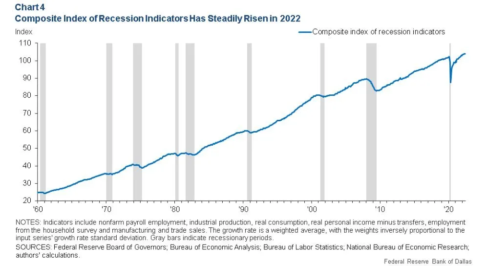
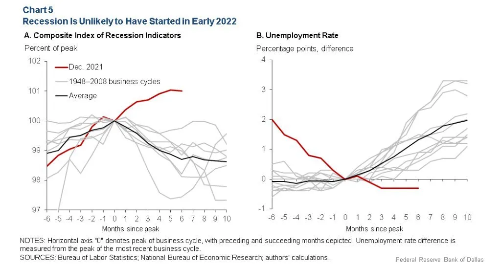
Here’s a chart that I borrowed from my friend, Michael Batnick. When the line curls down, it means that the economy is heading into, or already in a recession.
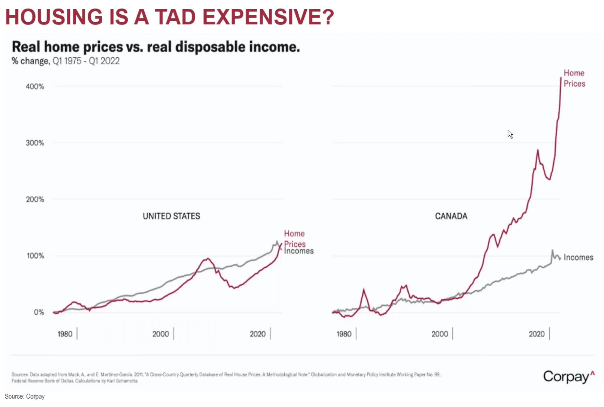
I’ve been asked many questions about mortgage rates, housing prices, and whether the recent growth is sustainable.
Are we going to see the kind of growth, going forward, that we’ve experienced in the past two years? Probably not – but man, are we spoiled or what?
Here’s some perspective to lay your eyes upon, below. This is a picture I snagged from my good friend and Canadian analyst, David Cox. It shows the enormous difference between the growth of housing prices here in the U.S. as compared to what they’ve experienced up in David’s hood. Maybe we need to chill out a little?
What’s the stock market up to these days?
Let’s skip where we’ve been – we already know that things have been rough for quite a long time at this juncture. Let’s focus more on the GOOD NEWS, and the higher probabilities that we might be faced with sunshine and blue skies in the not-so-distant future.
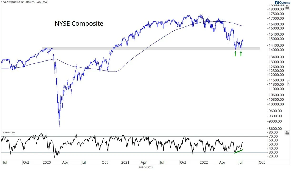
Here’s a chart I borrowed from a friend on Twitter in Austin Harrison. The NYSE composite is a basket of all the stocks traded on the New York Stock Exchange. It seems to me that we might be witnessing a textbook double-bottom pattern that corresponds beautifully with where it logically would make sense to do so (at the 2020 COVID highs).
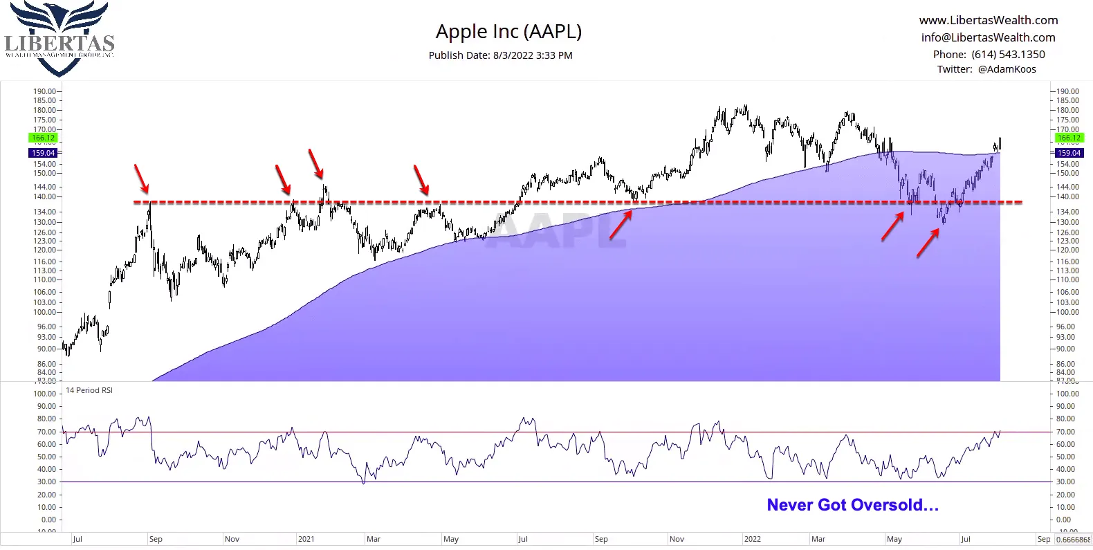
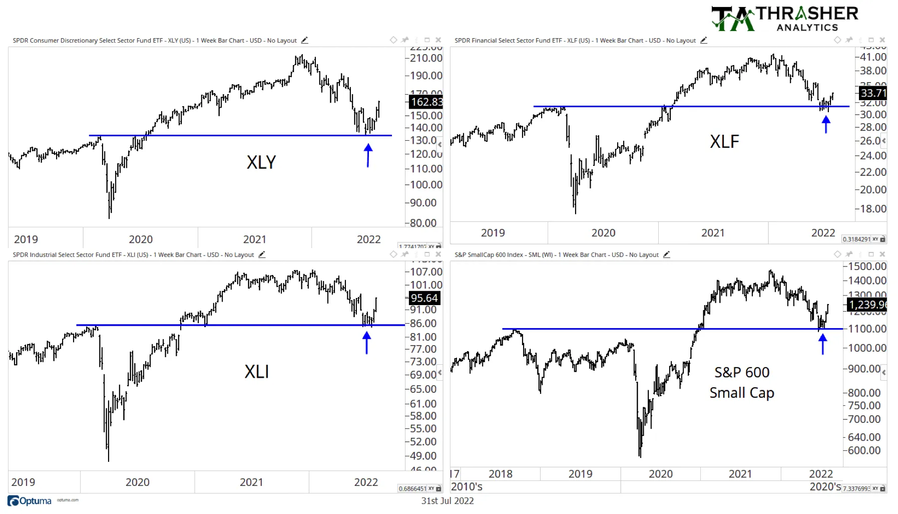
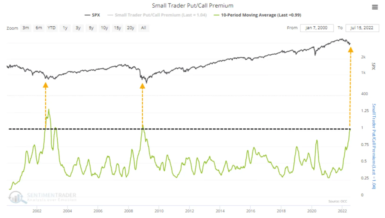
Now that you know that put options are bearish and calls are bullish, below is a chart that shows times in the past when the level of buying in put options vs. call options has reached extremes. Notice how it’s climbing above a level only surpassed by the 2002 and 2009 market bottoms.
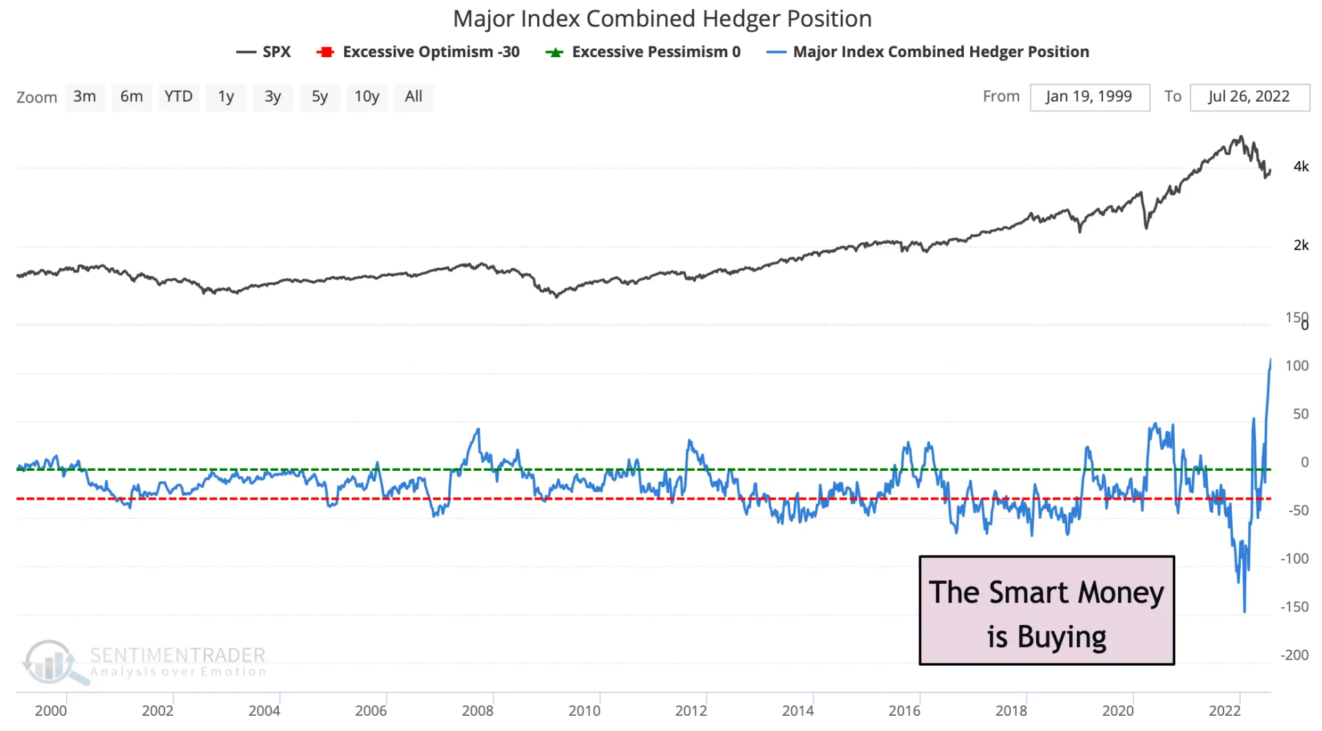
Now, notice (below) that, going all the way back to 2000, the smart money is buying up more U.S. stock index futures than ever before. This is NOT a bad thing!
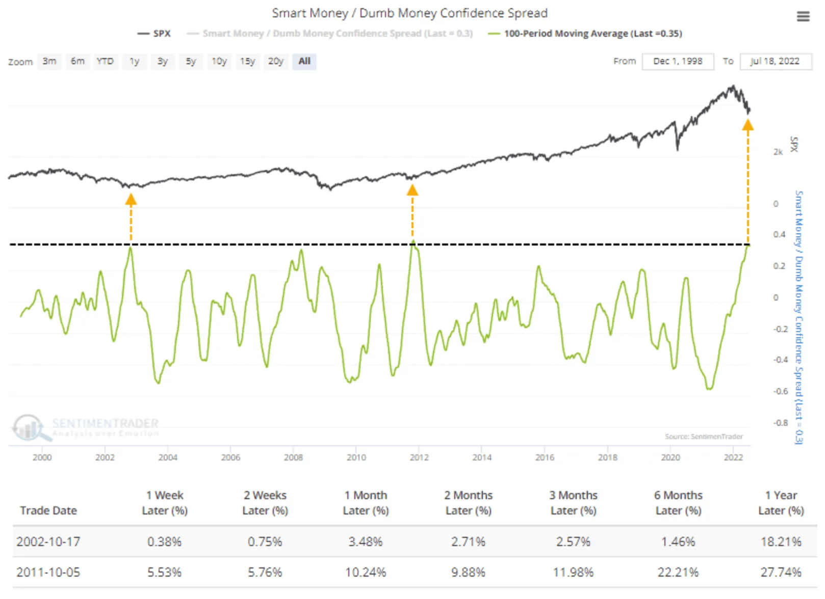
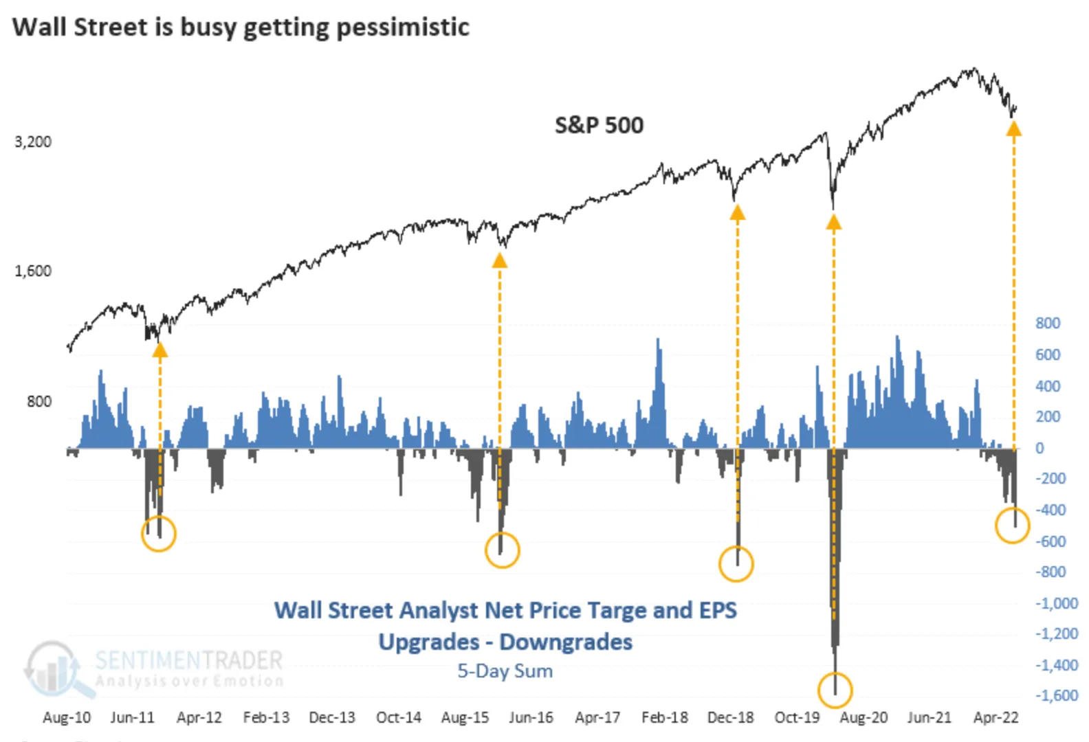
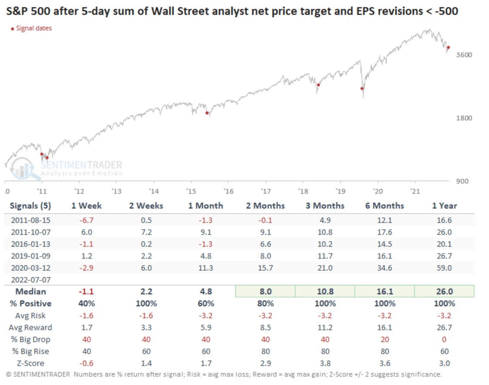
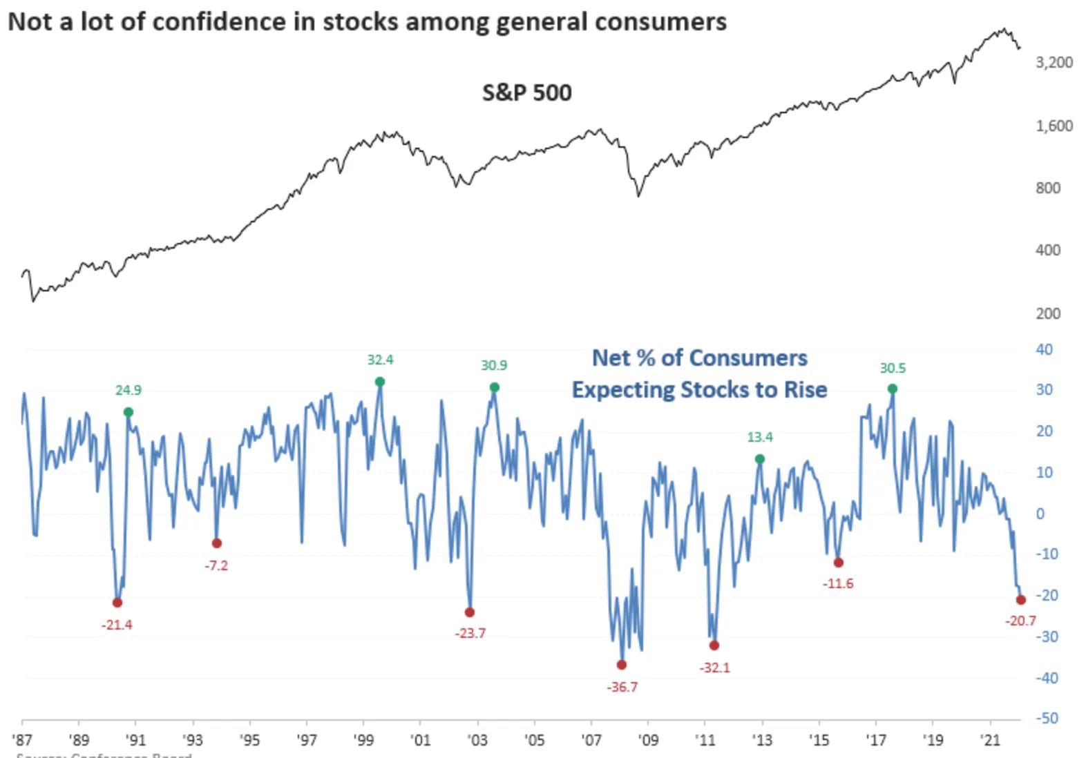
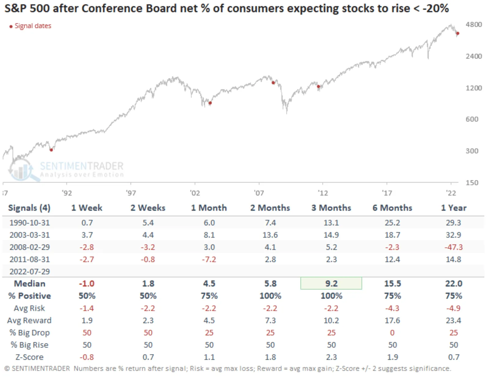
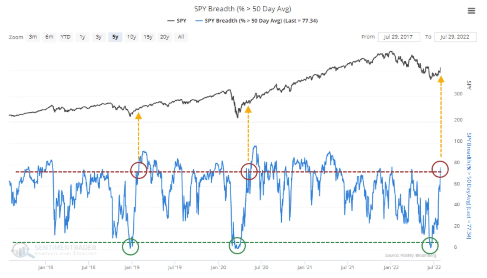
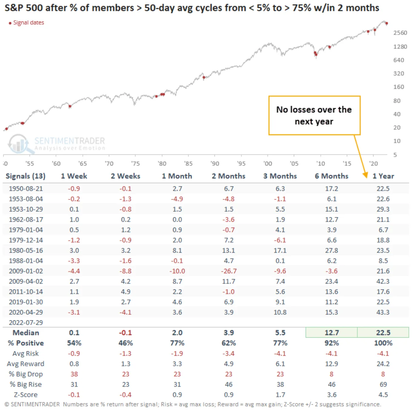
Alright, with this concept in mind, what you’re looking at in the picture below is the stock market in the upper-pane, and a special kind of momentum in the bottom pane that signals when the market turns its afterburners on. Notice the last two times we’ve seen this indicator go from one extreme to the other as fast. It occurred after the market bottomed in 2019 and after the COVID bottom in 2020.
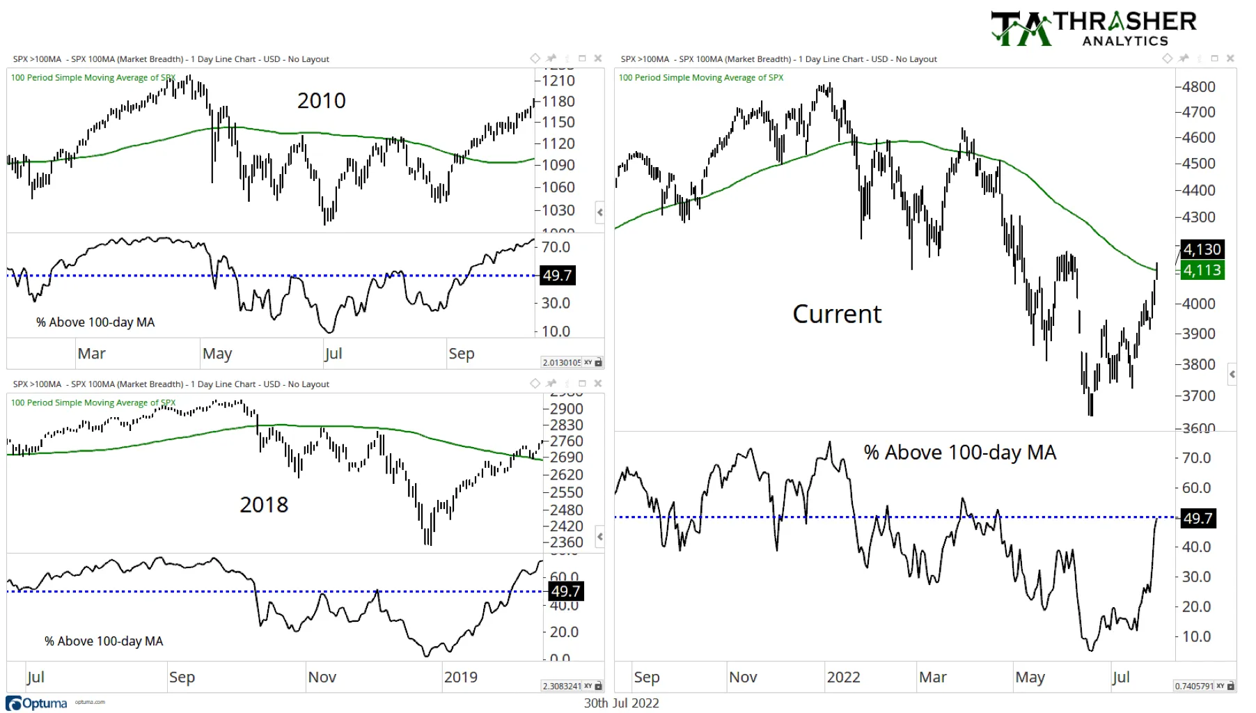
First, on the right, you can see the current stock market and how it was just able to rise above the smoother curved line, which is its own 100-day moving average (again, this is the average movement of the stock market – in this case – over the last 100 days).
When you compare that to 2010 and 2018 on the left, it gives you an idea of what might take place in the market going forward, if today’s market behaves like it did on those times.
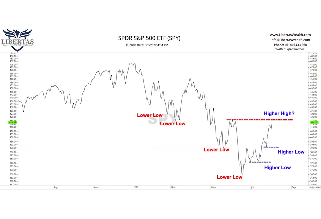
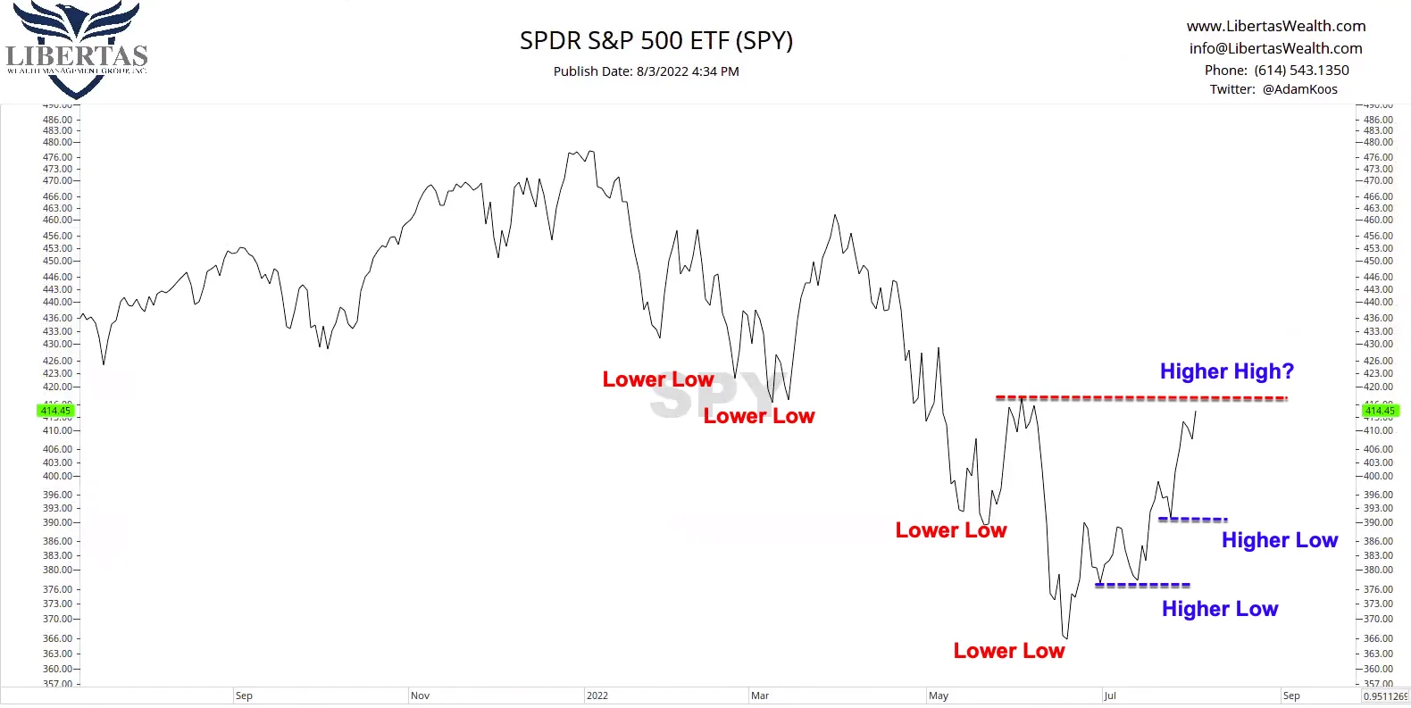
Up-trends are simply defined by higher-highs and higher-lows. Down-trends are defined by lower-highs and lower-lows.
What we’ve been seeing in the market – either in large company stocks, small company stocks, or both – is a series of downtrends over the course of the last 18 months.
However, what I’m starting to see is a stock market that looks like it’s trying to form a bottom, and when combined with ALL the positive evidence I’ve shared with you, above, I have to reiterate that I think we’re closer to the end of this drop in market prices than we are to the beginning.
Speaking of good news, here’s some for you… while I’ve never been a fan of it myself, it turns out Taco Bell is bringing back the Mexican Pizza!
In all seriousness, I hope that this helped add some honest perspective to what’s going on in the market (and the economy right now), and that you can rest assured that we’ve got your back…
Go spend time with your spouse, kids, parents, enjoy the summer weather, fire pits at night, pick up a good book, watch a movie or intriguing documentary, and instead of worrying about this stuff, let us stress about it for you.
Till next time…
Adam
Adam Koós is a CERTIFIED FINANCIAL PLANNERTM (CFP®), one of only 1,754 active Chartered Market Technicians (CMT) worldwide, a Certified Financial Technician (CFTe) thru the International Federation of Technical Analysts, and a Certified Exit Planning Advisor (CEPA). He’s been named by Columbus Business First as one of their 20 People to Know in Finance, was a recipient of the Forty Under 40 award, was ranked by Investopedia as one of America’s top 100 Most Influential Advisers, and is the winner of the coveted Better Business Bureau Torch Award for Ethics and Trust. Adam serves his clients as the president, senior financial adviser, and portfolio manager at Libertas Wealth Management Group, Inc., a Fee-Only, Fiduciary Registered Investment Advisory (RIA) firm, located in Columbus, Ohio.
The opinions included in this material are for general information only and are not intended to provide specific advice or recommendations to any individual or business. To determine which strategies may be appropriate for you, we highly recommend you consult with a fiduciary, fee-only financial advisory firm prior to investing.
